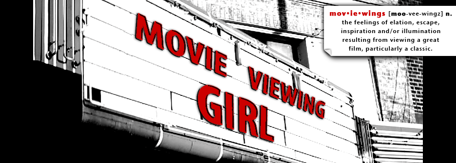
Just so we never completely forget the old look, here's a screenshot from an earlier version:

I'll miss you, teal and orange.
One other big change is in the works... as I review movies now, I will also be including my ratings. They will look like this:

(My range goes from zero to five wings, but I'm hoping never to have to use the zero.)
The wrapper may look different but the content will be more of the same, all things movie-related, with an emphasis on the classics.
Thanks everyone for reading and commenting; knowing I'm not just talking to myself here is helping to keep me going. Let me know what you think of the new look!


6 comments:
Fancy! Impressive! Big! Epic!
I like it, too. ;)
The new layout looks great!
I love the new look! :D
Groovy.
Thanks guys!
Impressive! Very cinematic new design!
Post a Comment